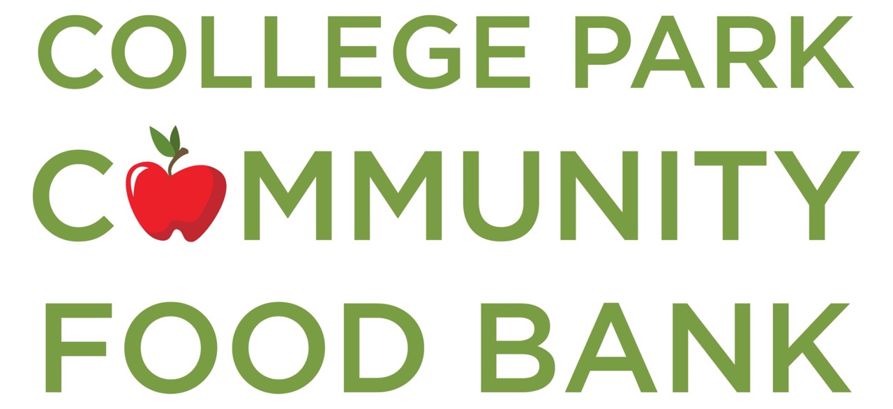
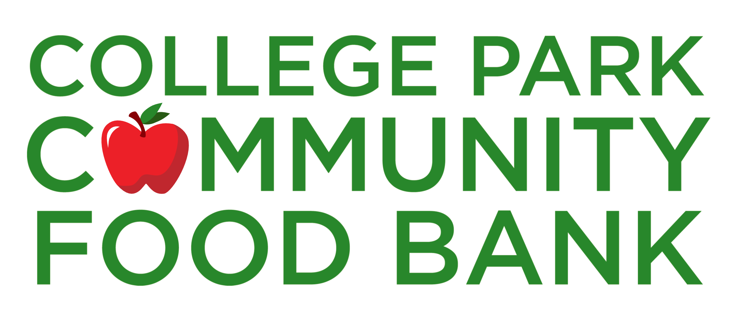
PROPOSAL 2: A redesign that keeps similar elements, but explores a bolder style with more visual hierarchy.
-
New, bolder font.
-
Spacing between text is even tighter.
-
More visual hierarchy between text elements: now, "Community" and "Food Bank" are emphasized.
-
Apple was recolored, highlights are softer and rounder.
-
Additionally: a second version of the logo was added, where the main focus is on the apple icon.
-
Expanded color scheme with more shades of green.


